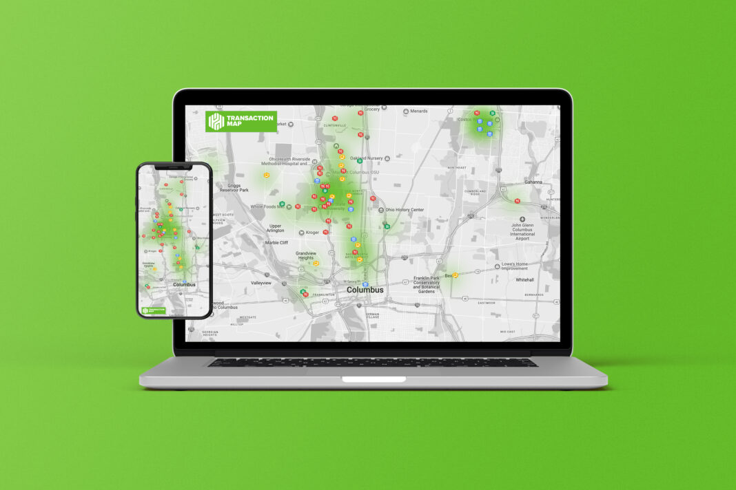
The objective is to provide consumers with an interactive map interface that visually shows their transaction locations, allowing them to gain insight into their spending habits in a geographical context. This can assist users in identifying and managing recurring expenses, comprehending local spending trends, and making more informed budgeting decisions.
It would include a user experience similar to Google Maps or Apple Maps, allowing users to zoom in and out, walk about, and click on symbols for detailed transaction details. Hovering over an icon provides a tooltip with transaction details, including the merchant name, date, amount, and any user-added notes.
Each spending category has its own color. All food-related transactions, for example, may be colored green, entertainment in blue, utilities in yellow, and so on. From a distance, this would allow users to readily identify the sort of transaction. A heatmap feature would show the locations where a user frequently conducts transactions. Denser colors imply higher spending locations, which might be useful in identifying high-spending zones.
Takeaways
Users may rapidly discover patterns and anomalies in their spending habits by viewing transactions on a map, and recognizing frequent high-spending regions might help users change their budget or behavior. On the security front, detecting unexpected transaction locations could be a red flag for potential illegal activity or fraud. The handling and use of geolocation data presents privacy concerns. It is critical to maintain data security, transparency regarding data usage, and user consent.


