

(Before you read the whole article, please note that the following is solely my personal impression of the UI Design 5.0 of ABA Bank.)
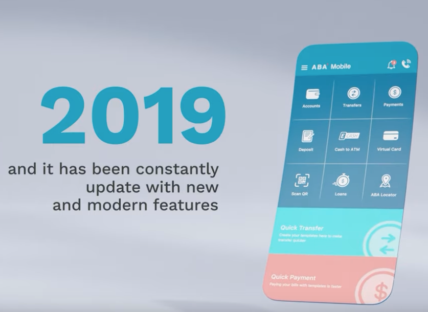
As a professional UX/UI designer residing in Cambodia, I must stay updated on the latest trends in modern UX/UI for popular mobile apps in my country. When it comes to banking mobile apps in Cambodia, one name stands out prominently — ABA. ABA is widely recognized and appreciated by everyone, not only for its extensive user base but also for its consistent UI layout since 2015. However, I personally have reservations about how far ABA has progressed in this regard.
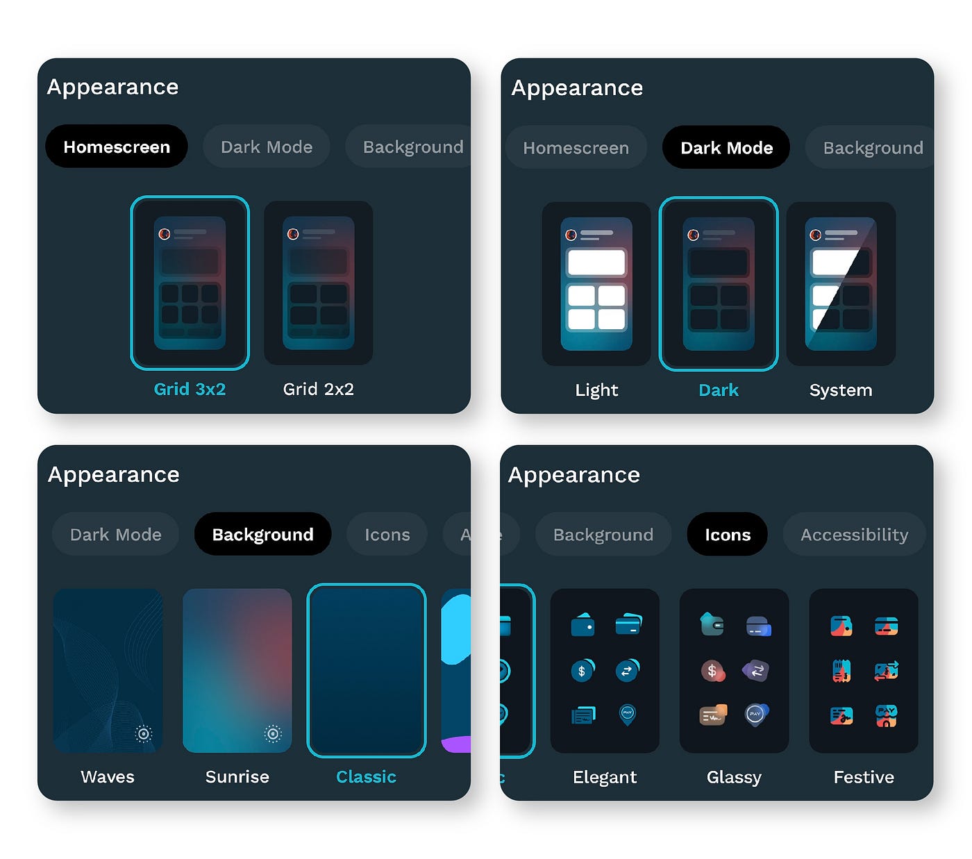
The new UI Design 5.0
The primary goal behind the development of UI 5.0 is to provide users with the ability to personalize and customize ABA Mobile according to their preferences. This includes the option to personalize various aspects such as Homescreens, Backgrounds, widgets, font sizes, and icons. When I first laid eyes on this modern UI, it left a profound impression on me, showcasing its impressive capabilities. The level of customization available truly stood out, making ABA Mobile a uniquely tailored experience for each user.
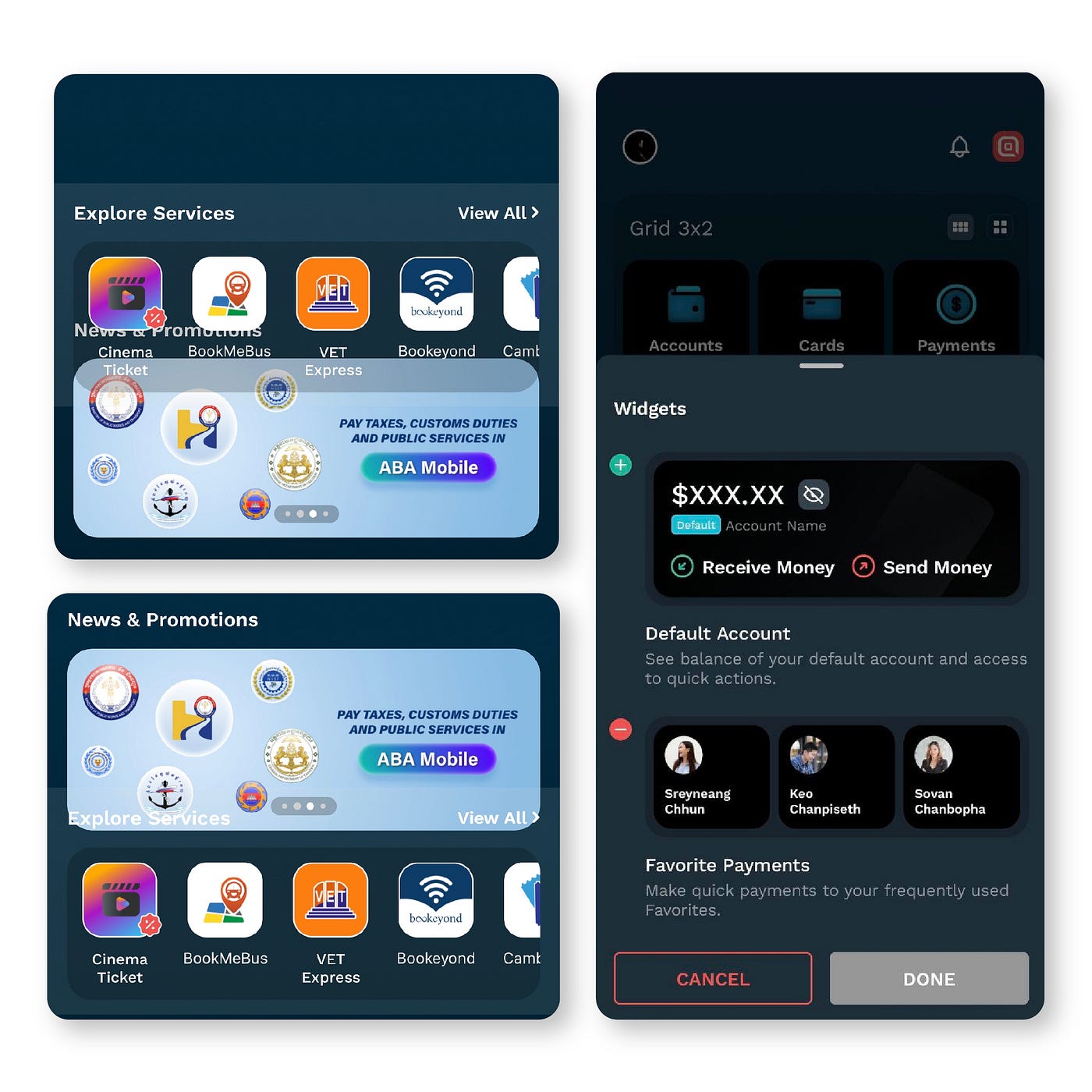
Customize widgets
In UI 5.0, ABA Bank enables users to customize widgets by adding or removing the “Default Account” widget, which displays the balance of their default account and provides key features for receiving and sending money. Additionally, users can effortlessly drag and relocate widgets “New & Promotion”, “Explore Service”, “Favorite payments” and “Discovery” to their desired locations, offering a personalized and intuitive interface experience.
This feature grants users the flexibility to arrange and organize their widgets according to their own preferences and workflow. By allowing users to seamlessly rearrange widgets, ABA Bank empowers individuals to design their ideal layout, ensuring that the most relevant and frequently used information and functionalities are easily accessible with just a few taps. The freedom to drag and adjust widgets provides a truly user-centric experience, enabling users to optimize their interactions with ABA Mobile and enhance their overall banking journey.
In conclusion and my personal impression
For me, this latest update of the ABA Mobile App is a huge updated and a big change since 2015. While this update may have both positive and potential drawbacks on their current millions of users. However, I firmly believe that this new update of modern UI will get users’ attention, and they will swiftly adapt to it.
This update is fueling innovation in the future of mobile banking apps. It sparks creativity and inspiration that will undoubtedly have a significant and lasting impact on the direction and development of mobile banking apps in the years ahead.
Analysis
This is an article written by a UI designer raving about a banking app interface update that left him excited for the future. But, I mainly used this article as my introduction to UI design, since I’m pretty new to the topic, especially for apps. My biggest takeaway is that personalization and customization are key. Customers should be able to build their personal accounts to cater towards their needs. We want the customer molding the app, not the app molding the customer. And it doesn’t have to involve difficult decision for them, either! It can be as simple as light versus dark mode, text size, pinned features, etc. The moment an app becomes difficult to use because it’s programmed to look and be used as a “once-size-fits-all,” we’ve lost the customer.
Source
ss


