Author: Alina Cohen
Date: Nov 28, 2018
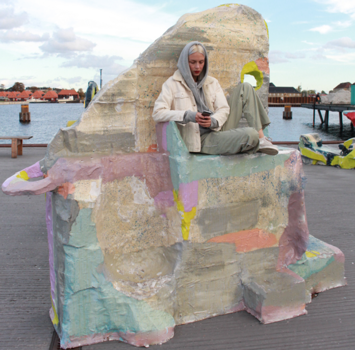
Jillian Mayer, Slumpie 69 – Shark Fin . Courtesy of the artist.A zany perversity is rampant in the studios of many young, contemporary creators who are trampling the boundary between furniture and fine art. For artists who want to break rules, this offers tempting propositions: chairs that aren’t meant for sitting, lamps that are less interested in illumination than in aesthetic verve, home goods that don’t work like they should. Rebellious aesthetes are turning old, recognizable forms—the sofa, the shelf—into objects for considerable contemplation. In their studios, provocation and individual expression override comfort and utility.One example among many is on view at the Carnegie International in Pittsburgh, where Jessi Reaves welcomes viewers to sit on her art. She’s created a sprawling couch that branches into tongue and tentacle shapes; patchwork fabrics with a metallic sheen give the cushioning an aura of trashy decadence. Around the room, Reaves has placed a variety of sculptures with an equally sexy-messy vibe. Threads hang loose, wire armatures are exposed, and function is an afterthought, though some of the wall-mounted pieces do resemble deconstructed chairs or shelves. While some pieces might be called “lamps” because there are lightbulbs inside, these are clearly art objects to look at, not to read by.Reaves is certainly not the only artist who is rethinking the line between furniture and art. She’s one of a handful of young talents—including Lucy Dodd, Misha Kahn, Jillian Mayer, Katie Stout, and the Haas Brothers—who resists such limiting labels as “designer,” “furniture-maker,” “craftsperson,” or “artist.” In truth, each of them represents a synthesis of all of these. Stout makes wacky, woman-shaped lamps; Kahn’s pieces often resemble characters just in from the cosmos; and the Haas brothers may be best known for their furry, function-free beasts. These artists’ exhibitions can be immersive and multi-sensory, turning their oeuvres into gesamtkunstwerk and their aesthetics into lifestyles.
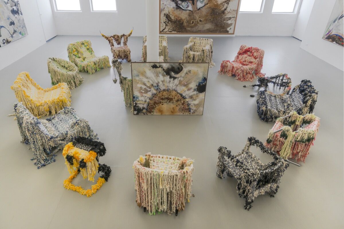
Installation view of Lucy Dodd, “May Flower,” David Lewis, New York, NY, 2018. Courtesy of the artist and David Lewis, New York.Shannon Stratton, chief curator at New York’s Museum of Arts and Design (MAD), often refers to these multi-disciplinarians simply as “makers,” or groups them into the larger visual canon as artists. “I don’t make a distinction,” she said. “Somebody working in clay is an artist. Somebody who’s making more sculptural, conceptual, functional objects—whether furniture or jewelry—is still an artist.”Since around the time of the Enlightenment, Stratton said, Western institutions have stigmatized objects that require intensive labor. Instead, the academy has favored work that conveys “wholly intellectual pursuits.” A class divide has long separated craftspeople from institutionally educated and sanctioned artists. Gender bias also plays a role. “Fiber, weaving, and textiles were very feminine pursuits,” Stratton said. Quilt-making, for example, was long dismissed as “women’s work.” MAD itself aims to eliminate such hierarchical distinctions between disciplines. Reaves’s couch, which required significant craftsmanship—and plenty of stitching and welding—rebels against such ghettoization. Its rough edges and non-traditional shape shatter ideas about what a couch should look like.It’s too easy to suggest that young “makers” are part of a nascent art-meets-design trend. Though they’re certainly producing some of today’s most intriguing—and at least nominally functional—objects, their interdisciplinary approach has a long history. By examining this narrative, we reconsider who we’ve valorized and neglected, and what we’ve fetishized or dismissed. Often, the record shows how we’ve reinforced inequity across gender and class. Thankfully, a new generation of gallerists, museums, and collectors are helping to smash such tired prejudice.
A brief history of art that’s also kind of furniture
Richard ArtschwagerChair, 1987-1990Schellmann ArtFurniture-making both inspired and financed the artist Richard Artschwager’s practice. Artschwager went to school in New York and Paris in the 1940s, finally settling in the former city. He got married, had a child, and temporarily relinquished his creative ambitions in order to support his burgeoning family, by making furniture and working at a bank.Throughout the 1960s, Artschwager returned to sculpture, taking advantage of his now-significant woodworking skills. For gallery settings, Artschwager installed forms that alluded to the structure of cabinets, chairs, and other furniture. Description of Table (1964), for example, is a simple painted plywood cube, with black pigment conveying an empty space beneath a wooden “table,” and white that suggests a tablecloth on top. Artschwager also used Formica throughout his career, sampling the surface and texture of common countertops. Looking at his work, it’s difficult to tell what belongs in a living room and what should be in a museum. His artwork advocates diminishing the barriers between both.In contrast, the Minimalist pioneer Donald Judd drew clear boundaries between his furniture and art practice. In the 1970s, he was already famous for his boxy sculptures: wall-mounted like shelves, or arrayed on the floor like unusable tables, benches, or storage units. During the decade, he moved from New York to West Texas with his family. Judd found no good furniture stores nearby, so he decided to make all his own furnishings. Out of necessity, then, he started constructing chairs, desks, and other functional pieces that shared many elements (sleekness, right angles, clean lines) with his artwork.Yet he viewed his two different modes of making as discreet activities. “The intent of art is different from that of [furniture], which must be functional,” Judd wrote in his 1993 essay “It’s Hard to Find a Good Lamp.” Yet he also conceded (albeit cryptically): “The furniture is furniture and is only art in that architecture, ceramics, textiles, and many things are art.” His son, Flavin Judd, recalls that public reception for his father’s chairs and dressers was not initially positive. “The world is divided up in two lanes,” he told Artsy. “People like other people to stay in their own lane.”Franz WestTwo works: Onkel Stuhl (Uncle Chair), 2003PhillipsDonald JuddUntitled, 1980ArtemundiJudd’s puritanical approach offers a significant contrast to that of Austrian-born Franz West. In the 1980s, West was already a renowned sculptor, best known for his “Adaptives” (Passstücke): white mixed-media artworks of varying shapes that viewers were allowed to pick up and touch, like strange toys. They resemble umbrellas, balloons, and distorted hula-hoops, evidencing West’s interest in the quotidian. His subsequent, now-iconic “Uncle Chairs” feature colorful, interwoven bands on the back and seat, beckoning viewers to not just play with his work, but sit on it. Functionality was always integral to West’s practice, no matter how the public chose to label specific objects. “It doesn’t matter what the art looks like but how it’s used,” he once said.Andrea Zittel, who lives in Joshua Tree, is something of a Judd heir. Since the 1990s, she’s built cabinets and beds fit for either galleries or homes. Even when her structures lack a specific function—like a raised platform with a wall emerging from it for no other purpose than to hang a fabric square—they still resemble architecture. In 2000, after trying out Brooklyn, she rejected urban concerns to live out in the desert, like Judd. She’s turned her 70-acre site into a comprehensive artwork called A-Z West. The compound features her living quarters, studios, cabins, and a variety of amenities for rotating groups of resident artists.And if Zittel is a descendent of Judd, Gaetano Pesce may be the paterfamilias of many of today’s most prominent young makers. In his New York studio, he creates soft, gummy bear–shaped armchairs of foam and stretch fabric; tables of cast polyester, or resin and foam, with inward slanting legs; and jagged-edged, multi-colored resin vases. A sense of indulgent whimsy supersedes more serious technical concerns. His creations ask: “Why can’t furniture be fun?”
The new guard of nonconformists
Jillian MayerSlumpie 3 – Q Chair, 2016Postmasters GalleryContact for priceJillian MayerSlumpie 16 – Knee Holder, 2016Postmasters GalleryContact for priceToday’s young makers have taken up this charge. They’ve all but gutted that old Bauhaus directive: “Form follows function.” A DIY aesthetic prevails today, which often either considers function as a kind of afterthought or challenges our idea of functionality altogether.For example, Jillian Mayer makes interactive sculptural objects called “Slumpies”—glittering, multi-colored, and lumpen, they resemble couches and chairs tailor-made for people who want to simultaneously sit and use their phones. The works feature various hoops and platforms amenable to anyone typing on a digital device.“I identified a problem (the slouched human body on their phone),” Mayer explained via email. Her sculptures, she said, are a “solutionist gesture” that invites users to indulge their love for both art and digital communication. They can even take pictures of themselves enjoying the work, while resting. It’s easy to see Mies van der Rohe turning in his grave.Bright and crudely finished, made from a motley mix of fiberglass, resin, wood, and enamel, the “Slumpies” exemplify what Stratton of the MAD calls “sloppy craft.” Anne Wilson, a professor at the School of the Art Institute of Chicago, introduced the term in 2007. In an essay included in the 2015 anthology Sloppy Craft: Postdisciplinarity and the Crafts, Wilson used the designation to convey an “intelligent and formally progressive” aesthetic found in Josh Faught’s colorful, loosely crafted, fiber-based work. She argued that such a contemporary style derives, in part, from “the ubiquity of computer screens…and the availability of seemingly easy perfection that demands its opposite—the wish for a more sensorial experience, materiality and the mark of the hand, privileging foible and imperfection, irregularity and uncertainty.”
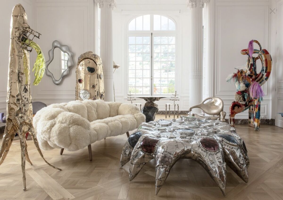
Installation view of Misha Kahn’s work at NOMAD MONACO 2018. Courtesy of Friedman Benda.As our lives become increasingly digital, in other words, younger makers are drawn more to roughness and individuality than the streamlined, sleek aesthetic that Judd advocated. Wonkiness is similarly pervading contemporary ceramics: Ruby Neri’s vases depict women’s bodies distorted to grotesque proportions, for instance, while Monika Grabuschnigg’s light-pink, life-sized totems explore the medium’s biomorphic potentials.For his part, Misha Kahn similarly believes that technology has impacted his practice, but in a very different way. “We’re all looking at Instagram all the time, consuming things. You’re never just looking at one thing,” he told Artsy during a recent visit to his Bushwick studio. On a typical day, Kahn might be covered in sawdust, coloring something, and looking at a picture of a baby elephant, all at the same time. His work perfectly articulates this busyness.For a 2017 exhibition at Friedman Benda, Kahn created a wooden platform that viewers could traverse. It served as a kind of maze around his various objects, which were submerged in mulch. Bronze Miss Fishy chairs featured spindly backs that resembled fish skeletons. An inward-curving cabinet looked more like a macrame totem than like anything you’d use for storage. Indeed, upon first glance, many of Kahn’s pieces look more like aliens than home goods. Washer/ Dryer/ Dishwasher (Low Model) (2017), made from interwoven wood and grass, resembles a furry, two-legged creature with three eyes. His mirrors are ringed with bright resin and vinyl accents, suggesting balloons or pool toys. Kahn’s list of materials frequently includes found objects—he relishes their textures and embedded histories. “Everyone’s grappling to represent what it feels like to be alive right now,” he said. “It’s hard to make something simple or straightforward and feel like you’ve in any way captured how weird it is right now.”Misha KahnGroup of black cement stools, 2016Friedman BendaKahn’s New York gallerist, Marc Benda, says that boundaries between art and design have been “slowly dissolving” over the past 10 to 15 years, with the wider art world taking “note of design as a concept.” Benda founded his Friedman Benda gallery in 2007, which now shows work that ranges from Ettore Sottsass’s exuberantly colored Memphis objects to Chris Schanck’s stalactite-studded mirrors and tables. Clients have followed Benda’s lead, and he believes that the contemporary generation of collectors have more fluid interests that take little stock of old hierarchical values assigned to design or art. (Still, Benda maintains a separate gallery—Albertz Benda—to display more traditional painting, sculpture, and video work.)Kahn’s friend and former studio mate, Katie Stout, offers a human counterpart to his otherworldly creations. She’s best known for colorful ceramic lamps shaped like naked ladies (their raised arms hold up the shades). They often feature uneven indents that look like thumbprints—individuality embodied. “From a conceptual level, she’s looking to challenge the norms of domestic space,” says Stout’s Miami gallerist, Nina Johnson. By creating objects for the home, Stout makes her work accessible beyond the art world bubble—attracting people who simply want to see how the pieces actually work.Johnson believes that her gallery’s location grants her significant creative freedom. She can exhibit more traditional “sculpture” and functional objects that strain categorization in a way that’s more difficult in New York. Her collectors aren’t distinguishing between objects on the basis of whether or not they can sit in them: According to Johnson, they’re more interested in conceptual underpinnings.
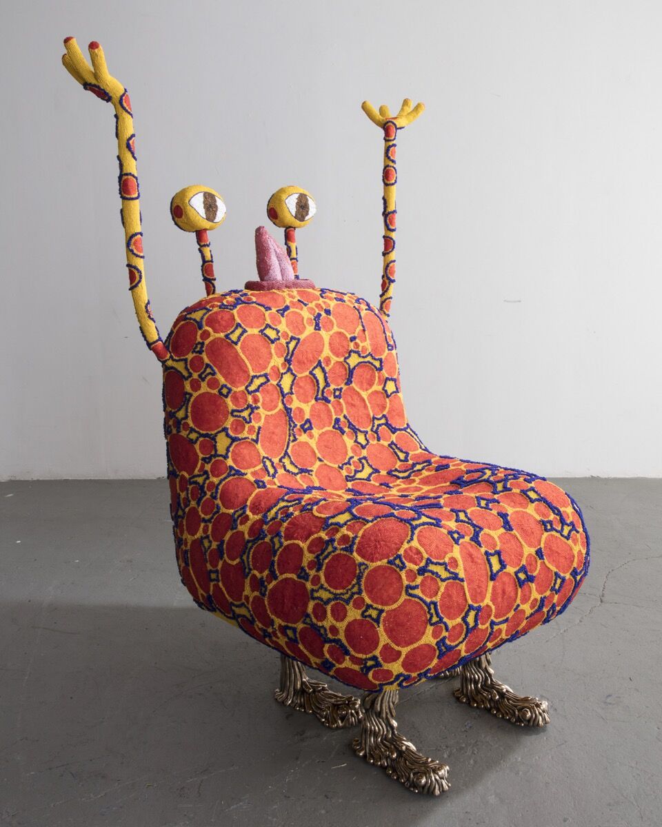
The Haas Brothers, Spotley Cru, 2017. Designed and made by The Haas Brothers and The Haas Sisters. © The Haas Brothers. Courtesy of the artists; R & Company, New York; and Marianne Boesky Gallery, New York and Aspen. Photo by Joe Kramm.
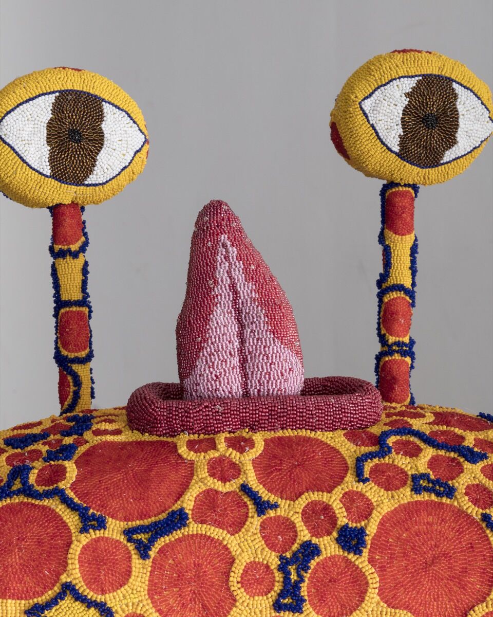
The Haas Brothers, Spotley Cru , 2017. Designed and made by The Haas Brothers and The Haas Sisters. © The Haas Brothers. Courtesy of the artists; R & Company, New York; and Marianne Boesky Gallery, New York and Aspen. Photo by Joe Kramm.To illustrate the point, Johnson mentioned an upcoming exhibition at her gallery that was curated by architecture firm Charlap Hyman & Herrero. It will include works that range from a picture by photographer Malick Sidibé to a lamp by the French multimedia phenom Nicola L. As Johnson says, “They’re both really objects that exist to challenge the viewer and create questions.”In New York, another boundary-pushing gallery, R & Company, represents Stout, as well as the Haas Brothers (twins Nikolai and Simon). The brothers’ oeuvre coalesces into a fantastical zoo: porcelain vases whose spiky round bottoms resemble sea creatures; sheepskin “beasts” with cast-bronze legs; and furry benches that evoke hirsute dogs (with a few too many feet). Not all of their works have a specific function. You could sit on one of their beasts, if you wanted, but it would make for an uncomfortable chair.“The only time we get pigeonholed is when we interact with the market,” Nikolai told me recently. Fairs such as Art Basel and Design Miami/ are particularly strict about who can exhibit in which venue. Last winter, carved stone chairs by Max Lamb were the rare exception to Art Basel’s stringent “no furniture” rule.Yet the issue isn’t just the market, but the way that humans are wired to think. “We are pattern recognizers. We thrive on categories,” Simon said. The brothers aim to expand viewers’ perceptions, pushing audiences to think beyond classifications that are not just aesthetic, but social, too. They want to create a deeper understanding of what it means to be “non-binary” in all facets of contemporary life.
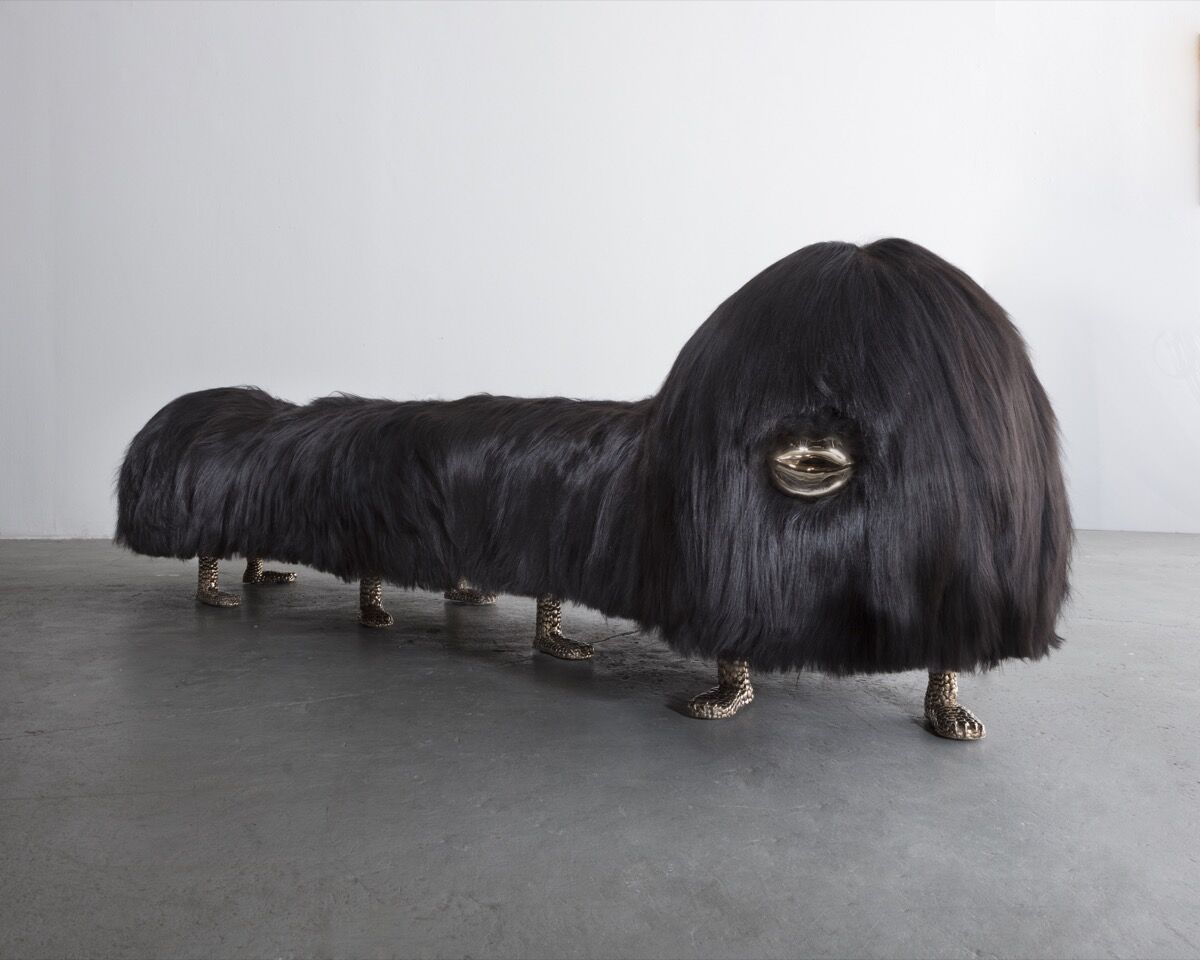
The Haas Brothers, Uma Worm-an, 2018. © The Haas Brothers. Courtesy of the artists; R & Company, New York; and Marianne Boesky Gallery, New York and Aspen. Photo by Joe Kramm.Miami’s Bass Museum of Art has even incorporated such a boundary eruption into its mission. This month, during Art Basel in Miami Beach, the museum will mount an exhibition by the Haas Brothers—the first that the duo has ever held in a traditional art space. Says the museum’s executive director Silvia Cubiñá: “There’s risk in redefining what contemporary art is in 2018.” For today’s creators, that risk is half the fun.In his 1993 essay, Judd wrote: “If a chair or a building is not functional, if it appears to be only art, it is ridiculous.” Contemporary makers, it seems, have no problem with that, and they’re happily making objects that are appropriate for our absurd times. Their creations are going beyond outlandishness just for the sake of it, though. Ultimately, they’re turning ridiculous into the meaningful and the sublime.
Comments:
There are many artists that have been bending the rules of this ancient craft of furniture making. There is a divide between people who think furniture has to be functional over form and the opposite.
I think there can be an agreement between these two sides. Furniture should and has to be functional but we see and live with our furniture every day, so it should evoke a sense of emotion. Furniture can be just as provocative and thoughtful as a piece of art you hang on the wall.
All of the artists in this article could use a service that directly connects them to their followers by being able to print pieces. This would allow a wider range of people to own a piece of their art, as well as making interior spaces less boring and more sensory.

