Data visualization, simply put, is the visual representation of data. Many people believe they excel at it just because they’ve done it for some time. Especially for those from an engineering background, they might view it as a minor task to quickly show results after the main analysis. However, visualizations are crucial for explaining complex issues to decision-makers. Despite its importance, many aren’t formally taught data visualization, expecting newcomers to just pick it up. This mindset isn’t ideal, as refining skills in this area can benefit even the seasoned experts.
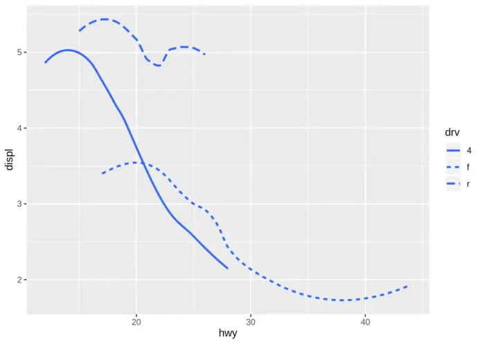
When creating a visual representation, it’s crucial to know its purpose. Given that modern data sets are often vast and varied, it’s impractical to depict every detail on one chart. Analysts must selectively decide what to highlight in a visualization to effectively showcase patterns and trends. Considering the reasons and methods behind creating these graphics can aid in these decisions. Everything should be made as simple as possible, but no simpler. Graphs typically provide a 2D representation of data with an x and y axis. Points on these axes reflect their respective values. This format, however, limits us to visualizing only two variables at once, even though we often want to understand the interplay of more than two. While 3D visuals can display more variables, they can be challenging to comprehend, tricky to create, and might not convey the message effectively. Although there are situations where real 3D models are beneficial, creating 3D visuals on 2D surfaces often isn’t worth the effort.
Analysis
In the modern, fast-moving financial world, understanding numbers is vital, especially for young bankers starting their careers. Data visualization helps simplify and interpret the large amounts of data they handle daily. Instead of sifting through detailed tables, they can use visuals like graphs and charts to quickly grasp financial trends and make decisions. For those new to the field, these tools are essential for effective financial planning. Visual aids can show one’s financial status, pinpointing areas like excessive spending or potential savings. Seeing visual progress, such as increasing savings, can also motivate better financial habits.
Mahoney, Michael. “The Art and Science of Data Visualization.” Medium, Towards Data Science, 14 Oct. 2019, towardsdatascience.com/the-art-and-science-of-data-visualization-6f9d706d673e.


