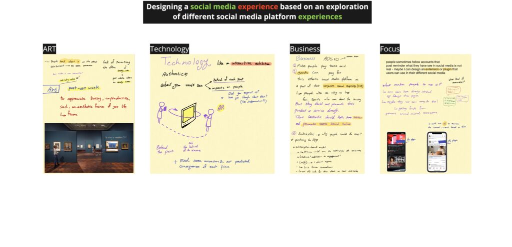
For this week’s conjecturing ideas, I tried to also design experiences without focusing on app ideas. So, as we talked about in class, designing a digital platform is just a form of user experience design rather than all of it.

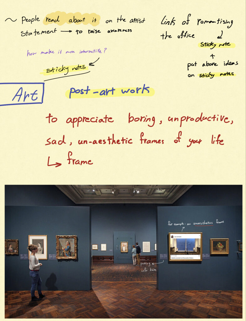
The first idea aims to appreciate boring, unproductive, sad, or un-aesthetics frames of our lives. The idea happens in a gallery of paintings. But visitors can see a few different frames hanging on the wall. This contrast may spark attention. These frames include different social media posts of a boring and normal life. For example, a messy kitchen with bad photography or a view of a normal and quiet office. And near each frame, visitors can read about the reason behind this different frame in the artist’s statement, near each frame.
Criticizing:
- This idea could not convey the meaning behind it. So, it needs to be developed. For instance, it should be more interactive. Users can make some changes to the art or put a physical comment on it or alike.
- Visitors come to specific galleries to see actual pieces of art. Does this idea make them unsatisfied with the gallery experience? Maybe they consider this idea as an unwanted interruption. Or perhaps they don’t even understand the point of this idea.
- Moreover, this idea is just a message; how we will be sure if it makes any difference. Maybe visitors just look at it as a piece of art. The question is how we can make it more effective with a more design-oriented perspective rather than an artistic view.


