Introduction:
Journey is a phenomenal game. “Only by understanding our past mistakes can we prepare for the future.” We travel through a once powerful culture, now decimated by greed and arrogance. It’s a sombre world at first, punctuated with symbolic gravestones in a desert of ruins, representing some catastrophic event from the past.
Personal Reflection:
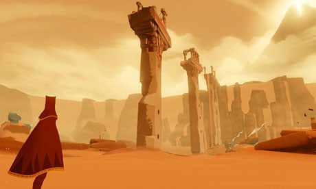
Journey is good at representing strong emotions through the scenes. The first thing attracted me was the strong lonely feeling from the cover image in this post. The first scene shows the player a barren landscape. The player must rotate the camera to see certain things. The only point of interest is a small hill with two flags on top that caught my attention. That’s the next step. It sounds ridiculous, but how many games start with a beautiful, complex world. Unlike those, Journey evokes emotion in the player with an absurd beginning.
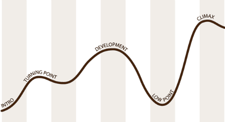
Journey states the emotional curve, which is a great example of my research studies. By limiting the game experience to a few hours, it seems to me that the game companies have managed to map the experience nicely onto the classic emotional curve. The choreography hopes that they want the player to feel the emotional changes through gameplay and aids, lighting, etc. Starting from the point where the player starts up the mountain, the pattern recorded on the change curve is strictly followed. I have learned a lot from this design pattern, and it’s good to use in my researches.

References:
Guardian News and Media. (2012, November 21). Journey and the art of emotional game design. The Guardian. Retrieved January 17, 2023, from https://www.theguardian.com/technology/gamesblog/2012/nov/21/journey-emotional-game-design


