

Author: Masterworks Fine Art Gallery
Artist: Andy Warhol
Link: https://www.masterworksfineart.com/artists/andy-warhol/dollar-sign-portfolios-1982
Andy Warhol’s series of repeated dollar signs using various bright neon colors on a neutral canvas produces dramatic effects of “identity, luxury, and wealth” that no other piece has had. This series emphasizes the overlapping between art and wealth: both being a state of luxury. His fascination with money stemmed from his financial instability as a child and his series ironically began during a time of an economic downturn for the United States–mainly during the Iranian Revolution and United States’ economic recession.
Warhol famously said, “say you were going to buy a painting. I think you should take that money, tie it up, and hang it on the wall. The when someone visited you, the first thing they would see is the money on the wall” (A. Warhol, The Philosophy of Andy Warhol: From A to B and Back Again, New York, 1975, p.134).
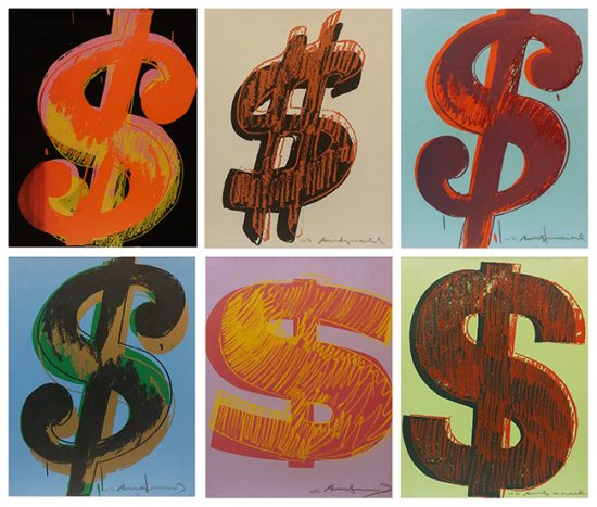
Warhol first produced a 19 3/4×15 5/8in sized set of six dollar signs.
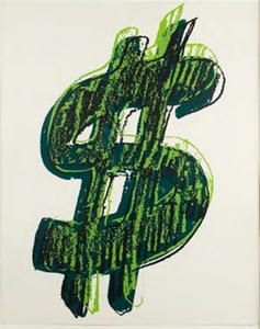
He also made a larger (20x16in) sized singular green dollar sign.
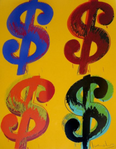
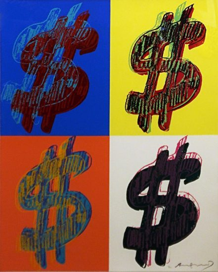
Next, he continued to make a 40x32in sized set of four dollar signs, each slanted at different angles and using different typefaces. Changing the style a bit, while keeping a similar size and layout, this next one had vibrant backgrounds producing a different emphasizing effect.
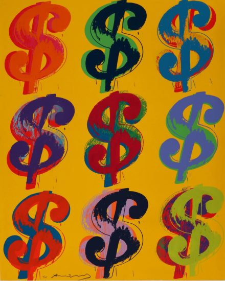
His last piece consisted of the same size but squeezing five additional dollar signs creating a 3×3 grid.
Analysis
Warhol provides a fascinating take on this symbol that many perceive to be an insignificant symbol used in our daily lives. Although only comprised in limited locations, the dollar sign comes in all sorts of typefaces, colors, sizes, and slanted forms–some even come with one and others come with two lines through its s shape. This symbol that has traveled all across the world has been around as a reason why most people are able to get through their life, while for others, it is a symbol that flaunts their luxury to the public. As Warhol mentions in his interview, if someone were to place money on the wall, yes, the first thing visitors’ attention would be caught is that money. In that specific scenario, isn’t that money serving the exact same purpose as art would? And, wouldn’t that mean money is a form of art? Likewise, Warhol’s piece serves a strong message of how this universal symbol equally communicates wealth and luxury can be taken in different styles both artistically and realistically.


