Published in Consumer Reports
June 2011
Why is there so much variation on prescription drug labels?
Part of the problem is that there’s no nationwide standard, unlike the Nutrition Facts labels on food packages or the Drug Facts labels on over-the-counter medication. Although the Federal Food, Drug, and Cosmetic Act requires certain details to appear on bottle labels (like the patient’s name and dosage instructions), other details can vary by state. The labels aren’t monitored by the Food and Drug Administration; rather, each state’s board of pharmacy is responsible for their content.
Most chain pharmacies send patients home with pages of instructions and warnings about the drugs, but a 2008 FDA study suggests that this literature usually isn’t helpful. Some research has found that the majority of people don’t read it completely because the language is too complex. Most patients rely on the information printed directly on their medication containers, which is why having an easy-to-read label and warnings is so important.
The U.S. Pharmacopeia, the authority that sets voluntary standards for prescription medication, and the Institute for Safe Medicine Practices recently suggested that it’s helpful to patients when labels contain:
- Words typed in easy-to-read 12-point type, with the patient’s name, drug name, and drug instructions in the largest letters. But not all pharmacies follow this suggestion. Harvard researchers who studied dozens of patient drug labels found that the words that are often the most prominent on labels pertain to the pharmacy itself, not drug information.
- Warnings typed directly onto patient labels in a large typeface. Research has found that fewer than 10 percent of people examine their drug containers for the colorful warning stickers that sometimes appear on the bottle. And warnings that appear on the labels that are typed in very small type can be hard to read or hard to find.
- The generic and brand name of a drug. This might prevent someone from mistakenly taking a double dose of the same medication prescribed by two doctors and filled at two different pharmacies, one as the generic version and one as the brand-name drug. Filling all of your prescriptions at the same pharmacy helps you avoid accidental mix-ups like this.
- Images or physical descriptions of the pills in the container. Someone who reads that he or she should be taking round blue tablets will probably call the pharmacy if there are oval-shaped white pills in the container.
- No extra zeroes (like 5.0 mg), so patients who take 5 mg of a medication don’t incorrectly remember it as “50 mg” when talking to a doctor.
- The pharmacy’s information—name, address, and phone number—at the bottom of the label, so the patient’s drug information is prominently displayed at the top for easy reading.
What we found: Bottle warning labels
One benefit of Target’s redesigned bottle is that it allows more space for more warnings and instructions on the back. In the case of the warfarin prescription we filled, the bottle label clearly included four horizontal warnings and one directive to “read the medication guide that comes with this medicine.” Walgreens also had four warnings printed on the bottle label; CVS had three printed on the label, Costco had two warning stickers positioned sideways on the bottle, and Walmart had none. (Filling another 5 mg warfarin prescription at the same Walmart a second time did yield a bottle with three warning stickers on it, as did a third trip to another Walmart in the area, though they weren’t the same three warning stickers on each bottle.)
How can there be different or missing warning labels? Drugstores use information from various software vendors, and the software sets the risk level of a medication based on scientific studies, says Carmen Catizone, executive director of the National Association of Boards of Pharmacy, which works with each state’s regulatory board.
And, while each state’s board of pharmacy has the ability to set guidelines for prescription bottle warnings, none of them has. “It’s up to the company and pharmacist to then decide what risk levels merit what labels,” says Catizone. “Some companies don’t allow discretion in affixing warning labels generated by the software system, while others make the warning labels available and it’s the pharmacist who decides which label to affix to the container.”
Source: https://www.consumerreports.org/cro/2011/06/can-you-read-this-drug-label/index.htm
Image:https://article.images.consumerreports.org/f_auto/prod/content/dam/CRE/salud/medicinas/240x175_pillbottles
Comment:
I selected this article are it outlines the main targets of issue that patients will deal with once given a prescribed medication bottle. The information displayed on the bottle will lead an individual to be confused or, due to the bottle’s appearance, poeple will not investigate further their bottle which contains important information. Additionally, in regard to warning labels, the amount of appearances from various bottles can also raise questions within the patient in regard to what it being provided and what is not. Overall, this article identifies the pain points that an individual has to endure to ensure they: take the correct medication, from the correct vendor, with the correct dosing, and at the correct time.


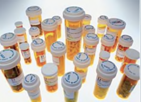
I think that the scariest thing about the design is that each prescription bottle looks the same. This right there shows that the healthcare system has not really thought about this from a usability standpoint. If all of the bottles look the same and have the same design, it’s easy for everyone to slip up…the pharmacist just has to be tired and they will give you the wrong bottle…and you have to just not be paying attention to take the wrong pill at the wrong time of day. Have you ever played those brain game apps? The thing those apps teach you is that if every shape is a triangle with stripes, then one is a filled triangle, it’s hard to know the difference. What I mean is there is not enough variation on the bottle itself to give the bottle a visual queue to the user without reading the label. Why do you not brush your teeth with your lotion? Well, they look completely different! The shape and color of the bottles should be signals for something…to make it easier to understand what it’s for. This is just a thought…but think about it.