Source: https://www.bimcommunity.com/news/load/1181/how-crucial-is-interior-design-for-supermarkets
Overview:
“Retailers understand that supermarket layouts and merchandise placement can impact consumer spending considerably”
Shopping for groceries may constitute retail therapy sometimes, for some people, but generally, it’s a chore. It’s a chore that involves spending valuable time at supermarkets that know how to work on human psychology to induce people to buy items they don’t really need. Interior design in supermarkets is geared towards optimizing this social reality. Retailers understand that the layout of supermarkets and the placement of different items can impact consumer spending considerably. The designing of a supermarket’s layout requires insight into basic human psychology. Designers spend time and effort creating a supermarket layout that will influence customer spending. The flow, merchandise placement, and ambiance of the store layout will affect the behavior of customers. Retailers can assess their proposed revenue by looking at these layouts, resulting in informed decisions regarding the pros and cons of their mix of merchandise and where to place them.
Interior design features retailers use to provoke additional sales include the following:
Grouping
Merchandise is grouped in categories so that when customers are looking to buy a specific product, they will discover other related products, which they may or may not require. Salsa and chips, bread and sandwich spreads and detergents, and rubber gloves are placed adjacent to each other.
This also involves placing similar brands close together to ensure that customers who are loyal to a brand are able to find the one they want, resulting in additional cross-category or cross-brand sales.
Layouts for Theft Prevention
Displays or sections with small items that can be easily stolen are typically placed near security support, such as near the exit, before the check-out counter – somewhere that has extra security personnel or that involves a barrier for an extra physical movement so that it is not easy to flee from the premises.
Displays that Encourage Positive Vibes
When customers are feeling good and comfortable, they feel good about their purchases. Layout design can set the mood through merchandise placement, aisle space, and colors of fixtures and walls.
Other ways Grocery stores are changing interior space:
- Increasingly, supermarkets are contributing to initiating and sustaining social connections. Delicatessens and cafés should ideally be located at one of the front corners, so that people have the option of eating first, relaxing, and then shopping, making it more likely that they will buy more items.
- Sampling stations, special live display counters, and cooking demonstrations typically line one of the outside walls to slow customers down while they are exposed to other products.
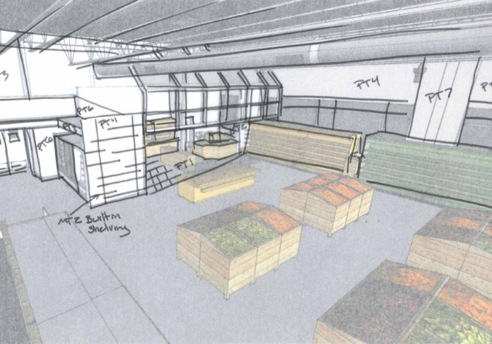
- Enabling the development of 3D design in décor manufacturing, lighting, and interior design involves the use of 3D modeling software, lighting test labs, and a design resource library. Lighting tests can help predict the effects of bright, fluorescent lights or soft mood lighting on triggering a need to buy in customers. Such 3D previews help visualize the supermarket and its effect on the shoppers inside.
Analysis:
This article gives an in-depth understanding of interior spaces in grocery stores and how these nudges activate different behaviors. I wonder if I could take these interior elements of a grocery store and design them into car storage. This article makes me question if these systems are reading for a physical or digital change in the stores that are more centered around the user rather than profit.


