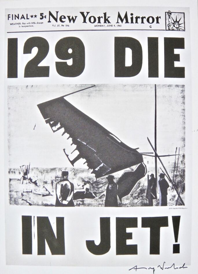
…Among Warhol’s first confrontations with the theme of death were 129 Die in Jet!, his 1962 reproduction of a New York Mirror front page, as well his earliest portraits of the late Marilyn Monroe. Moving into 1963, Warhol quickly advanced beyond these oblique references to confront fatality squarely in its grim face through the operation of silkscreen. He had embarked on what would later be known as the Death and Disaster series.

Sustaining the shrewd cultural commentary behind his seminal Pop Art canvases such as 32 Campell’s Soup Cans, which launched him into the art world in the early 1960s, Warhol explored a darker side of American life in the middle of the century with his Death and Disaster series. This loosely connected group of roughly seventy artworks takes as their subjects car accidents, suicides, electric chairs, even contaminated cans of tuna fish that were reported to kill two housewives in the Detroit suburbs. Warhol avidly appropriated his source material from newspapers and police photo archives, manipulating the industrial silkscreen technique to mechanically repeat these lurid images across broad swaths of canvas. In this daring detournement, Warhol created an endlessly haunting psychological portrait of American popular culture by focusing on its morbid fascination with violence and tragedy.

Within the broader Death and Disaster series, the Car Crash paintings that Warhol made between late 1962 and early 1964 form the most extensive and variegated group of pictures. Drawing on six different documentary source photographs of separate automobile accidents, Warhol’s Car Crash paintings examine the quotidian reality yet sensational spectacle behind the mass-media broadcast of everyday death. White Disaster (White Car Crash 19 Times) is the largest single panel Car Crash painting Warhol ever executed, and it stands out for its expansive white surface that resembles the lamina of mass-produced newspaper. Warhol’s impersonal rendering on canvas of a found newspaper photograph – one that remains unidentifiable to this day – totally silences the faceless subject by suspending him in perpetual anonymity, even while dramatizing the cinematic finality of his death.


… Cascading down the monumental canvas to evoke the lamina of newsprint and the cinematography of filmstrips, the silkscreened image in White Disaster (White Car Crash 19 Times) speaks to Warhol’s preoccupation with ideas of death within the cultural context of the news media zeitgeist. Warhol’s Death and Disaster paintings most powerfully tests his own famous hypothesis when he said in an ARTNews interview in 1993 that “The more you look at the same exact thing, the more the meaning goes away.” As we behold Warhol’s Death and Disaster paintings, the original macabre of Warhol’s source imagery may seem to evaporate, but the legendary artist’s timeless artistic achievement never cease to persist with auratic intensity.
-Sotheby’s. (2022, November 11). Warhol’s death and disaster: Transforming tabloids of common catastrophe. Sothebys.com. https://www.sothebys.com/en/articles/warhols-death-and-disaster-transforming-tabloids-of-common-catastrophe
Warhol’s transition from documenting aspects of popular culture and life to those of death was a brilliant change of pace for his art and career. The pieces in the Death and Disaster series perfectly capture how the once shocking and heartbreaking has become repetitive and mundane as the media exploits it. It’s especially relevant today, as content like movies, tv shows, video games, and news stories are constantly upping the ante in order to get eyes on their product. Television ratings, ticket sales, and online views are never high enough, so the content has to become more shocking. But in the process, people have become desensitized to tragedy and violence.
One way I can relate this artwork back to my capstone project is to focus on vehicle safety and keep in mind that common tragedies are still tragedies. It’s easy to see statistics about car crashes and disconnect yourself from the human lives lost or forever altered. By fully allowing ourselves to feel a tragedy, we prevent this disconnection and we will further emphasize safety in whatever we design.


