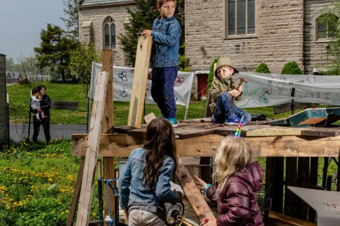
The Yard, for kids 6 through 13, lacks the usual monkey bars, slides and swings. It is, however, well-stocked with dismembered store mannequins, wooden packing crates, tires, mattresses, an old piano and assorted other detritus of the modern world.
Despite a steady rain on Saturday, the opening day for the season, The Yard was a hive of activity. Joey Gunderson, 11, and his crew were attempting — not altogether successfully — to nail together wooden boards and plastic sheeting to construct a ramshackle “house.”
“Playgrounds have everything already built,” Joey explained, “but it’s funner to build whatever you want.”
“Sometimes parents hover by the fence and watch their kids like animals in a zoo,” said Rebecca Faulkner, the executive director of play:groundNYC, the nonprofit that runs The Yard, which opened in 2016. “I tell them, ‘You don’t need to worry, you don’t need to tell them what to do. Just sit back and relax.’”
Source: Schiffman, R. (2019, May 10). Making playgrounds a little more dangerous. The New York Times. https://www.nytimes.com/2019/05/10/well/family/adventure-playgrounds-junk-playgrounds.html?searchResultPosition=17
Analysis: In a way I think that this article helps to get some perspective. Take a step back, reanalyze if an idea has been over-designed, tweak as needed. I like that this company boiled play down to the very basics to still maintain a playground but a more robust version that lets kids shape its landscape. I like this for the ideation process I can put myself through. What is the most basic form a design could take? What is this design trying to evoke at the foundation?


