

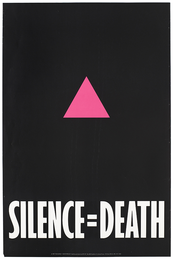
I was interested in how organizations inspire collective activism so I looked towards the AIDS movement. I found this article written by the head designer of the Silence = Death poster talking about his and his teams’ process.
“SILENCE = DEATH: How an Iconic Protest Poster Came Into Being” Excerpt
“In essence and intention, the political poster is a public thing. It comes to life in public spaces, and outside them, is academic. Individuals design it, or agencies or governments, but it belongs to those who respond to its call. Once it hits the street, if it manages to tap into the zeitgeist, it may have its “moment,” and when it does, it’s the audience that determines that rare cultural nanosecond. Authorship takes a back seat, and the public sphere resembles the exercise in collectivity we hope it to be.
For public discourse to pierce through the churning perpetual motion machine of the American commons, it needs to come in bursts. Manifestos don’t work. Sentences barely do. You need sound bites, catchphrases, crafted in plain language. The poster is exactly that, a sound bite, and vernacular to the core. The poster perfectly suits the American ear. It has a power. If you’ve ever stopped in front of one or turned your head for a second look, that power was at work. You may barely have been aware of it because of its hammer-and-nails simplicity, but you were caught up in it just the same. It’s not art, if art is for museums. It’s far more robust than that. It comes for you in ways art simply can’t. The poster comes for you where you live.
Street life in Manhattan is also class stratified by transportation means, so audiences can differ wildly. Most locals traveled by subway or on foot, and very few Manhattanites in those neighborhoods kept cars at the time. Still, many took cabs, car services, or buses, and people from the outer boroughs and suburbs frequently traveled by car. Most New Yorkers commute to work, but tend to prefer neighborhood leisure and support services, and they also walk a great deal. So we surmised it would mostly be local audiences who encountered the poster up close if they lived or worked near a poster site, and everyone else would come across it through a vehicle window. As a result, I insisted we apply a “Can you read it from a moving vehicle?” test for the font, and we tiered the messages to both points of discovery. In addition, some levels of meaning would need to be explicit, and others distinctly coded.” (Finkelstein, 2017)
.
REVIEW
This is written by one of the designers of the “Silence = Death” poster during the AIDS movement. I found this interesting because it shows how a person considers making a product for collective activism. Things like being “bold” and to be different from “art in a museum” are both important to incorporate in my design decisions moving forward. I can apply the same process that they did in understanding their end user of New Yorkers to my own audience of visitors at Ohio Parks to figure out the best end product to attract their attention. As I am trying to promote change in individuals by changing their behavior, I think learning from successful activism movements and the graphic design from them are both interesting and important. A lot of the sustainability content ODNR already has is very word heavy, and I appreciate when they said they applied the “can you read it from a moving vehicle” test for font and image choices, and I hope to continue that theory through the visualizations I create. I personally do not go to the park to read!
REFERENCES
Finkelstein, A. (2017, December 1). Silence = death: How an iconic protest poster came into being. Literary Hub. https://lithub.com/silence-death-how-a=n-iconic-protest-poster-came-into-being/


