By Stacey Wang (2017)
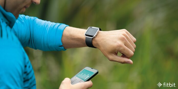
The author Stacey categorizes herself to be the people who are in the middle of an exercise freak and a couch potatoes, someone wants to be fit and health but need some motivation to go to the gym. And this type of person are the general consumers of the multi-billion dollar worth of wearable fitness tracker market. Stacey shares her insight on the experience of using Fitbit and it’s iOS app from a perspective of a UX designer.
The whole reflection on the design follows IDEO’s human-centered design and Lean UX Design Thinking.

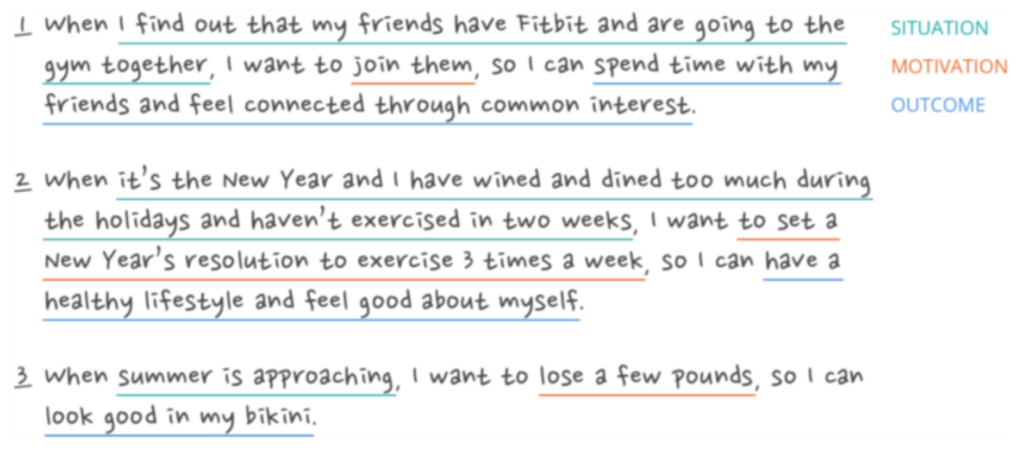
Job stories
She used Jobs to be done framework to create stories based on interviews with Fitbit users.

Stacey also conducted a usability test by creating scenarios with a series of tasks, going to strangers, and asking them to complete the tasks on the app. She then jot down each pain point onto a post-it.
Here are the problems that she identified through the usability test and analysis.
Problem 1: Discoverability issue with tracking and logging exercise
There are two entry points to track or long an exercise and both are problematic. One being hard to see, the other one has the icon that is not relayed to logging an exercise.
Problem 2: Users had difficulty finding the relevant exercise type to log
Fitbit’s database has over 100 exercises, but the app does not show all of them. Users often find it difficult to search for exercise that matches the exact exercise in Fitbit’s database. “the prompt was to log a chest and arms workout at the gym. The user could not find any matching result by searching “chest”, “workout”, “arms” or “gym”. The most relevant exercise type on the database is weights but this is unknown to the user.”
Problem 3: Users could not edit exercise records apart from exercise type
A user can only change the exercise type after an exercise is recorded. This leads to either an exaggerated or inflated exercise time which could be discouraging and frustrating to the user.”
Problem 4: Users had trouble finding how to challenge a friend
The sociability aspect of the Fitbit was one of the popular feature.
The user expects to be able to perform social actions (including challenging a friend) on the friend’s page, but the current Fitbit does not accomplish that.
The solution and the prototype
Stacy came up with solutions that addressed all the problems listed above and a working prototype of how it would look like.
Fitbit is a very innovative way of encourage people to exercise. It faces one of the biggest challenges which is to change a person’s habit. The reason why it’s successful is because it has tools like setting personal goals, tracking and logging exercise and social fitness challenges.
–
Though it is important to design a product or service that is both aesthetics and function, we as designers also need to think beyond the two and consider how the user would interact with the product. It’s the detail in the user experience design that makes a product more appealing to the users. Especially for products that promote habit-forming, if it has a bad UX, then the function the product becomes less effective.


