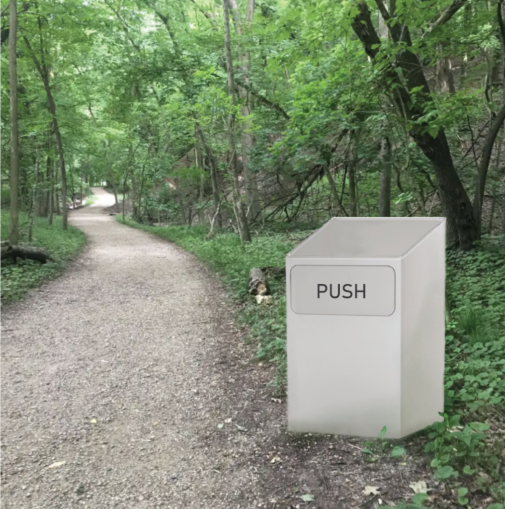
Above: “Trash Map” rendered with Vizcom. Original sketch in bottom right corner. Prompt: shiny white plastic box with rounded rectangle push door and clear acrylic plate on top.

The “Trash Map” would be placed along park trails in place of traditional trail markers/maps. When closed, it is just a trash can, when someone pushes the door to throw something away, the trail map appears, along with a small LED light pinpointing where you are along the trail. Hikers are encouraged to properly dispose of their trash along their hike, and also pick up litter they see as they are walking along the trails.
The “Trash Map” references the ThinkScream’s smart trash can, but instead of providing wifi, the “Trash Map” provides trail directions. With my version of the smart trash can, it is also technically not required that users throw something away. The trail map can be activated simply by pushing the door. I made this change because hikers shouldn’t get lost simply because they don’t have any trash to throw away.
There’s quite a few logistical issues with the “Trash Map”. How would they be powered in remote wooded areas? Who empties them? It would be nearly impossible or at the very least inconvenient to have park staff collect trash in remote areas. There’s the issue of making sure animals don’t find their way into the trash cans. The current design would also need a lot of reworking because as of now it just looks like a washing machine in the middle of the woods.
However, the point of the “Trash Map” is to make throwing trash away a required, or at least highly encouraged task to be completed in order to recreate in state parks.
Kavilanz, P. (2016, February 23). Want to clean up India? Turn trash into free Wi-Fi. CNNMoney; CNN. https://money.cnn.com/2016/02/23/smallbusiness/india-trash-bin-wifi-thinkscream/index.html


