The articles I found were very interesting in showing me the importance of designing off on Honda’s visual brand language to create a product that is visually understandable and readable. In addition, I saw opportunities to design more interactive and playful products that bring enjoyment alongside functionality.
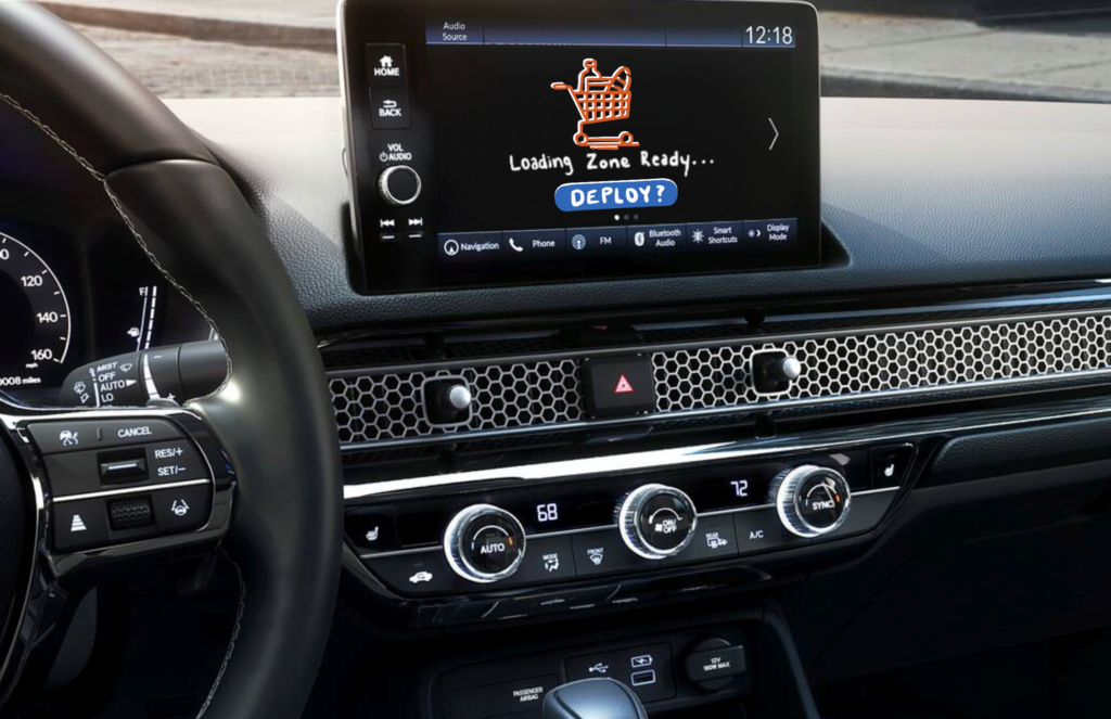
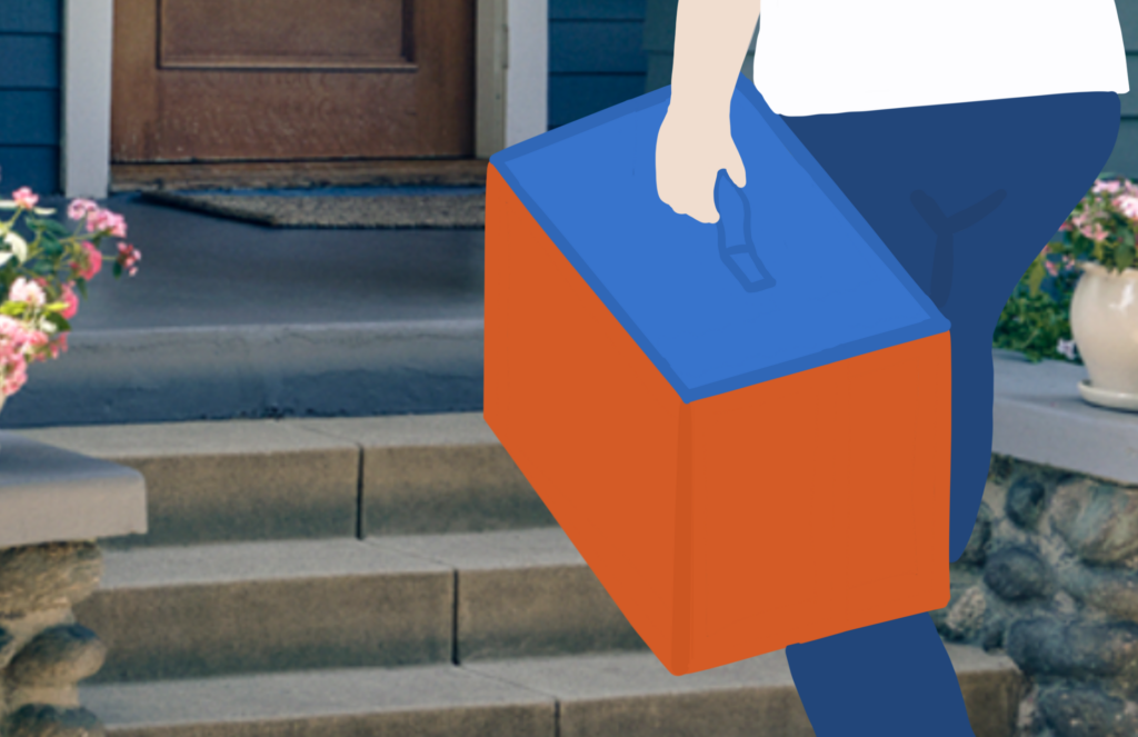
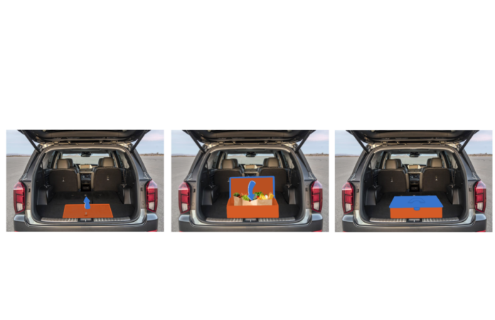
My conjecture is an interactive origami-style case that builds over the groceries once placed inside the vehicle truck area. This is deployed by pressing a button on the dashboard of your vehicle once all the groceries are placed in the loading area. This allows for entertainment or play because you watch it build over the groceries. Once you are home, it becomes a stylized case that you can carry into the house all in one go instead of multiple trips. I think there are a lot of interesting concepts in this initial design, and I plan to pull aspects from this design for my final product.


